Getting started
What it is
This page covers the basics: signing in, how access is scoped to you, and the landing dashboard you see first. A full screen-by-screen walkthrough with screenshots arrives in a later phase of this guide.
Why it exists
ManpowerIQ shows different people different things. Before any task, it helps to know how you get in, why your view may differ from a colleague's, and how to read the dashboard that greets you.
Key concepts & terms
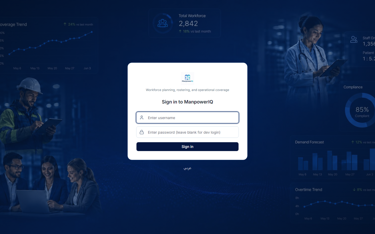
- Sign in — you access ManpowerIQ with your ManpowerIQ credentials (username and password).
- Role-based access — what you can see and do is governed by your roles. Two people signed into the same business unit can see different menus and screens. See Roles & permissions.
- Business unit (BU) — your tenant. Your data is scoped to your BU; you never see another company's data.
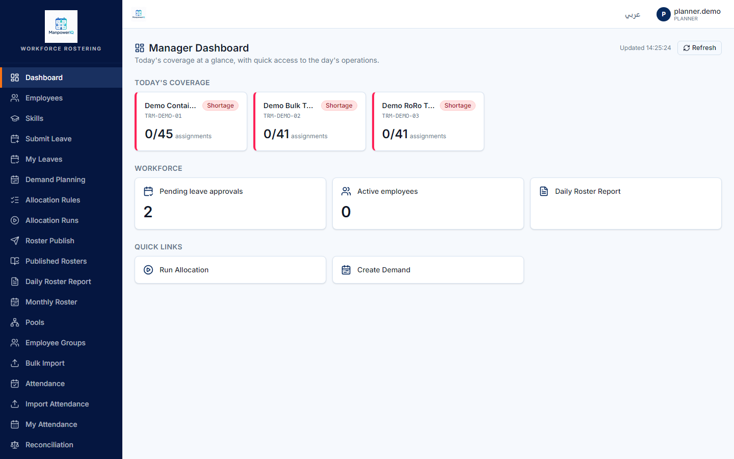
- Dashboard — the manager landing page: a board of status tiles, not charts.
- Coverage tile — a per-terminal tile comparing today's demand to today's published headcount, marked Covered, Partial, or Shortage.
How it works
Signing in. Sign in with your ManpowerIQ credentials. What you land on, and which menus you can reach, is decided by the roles assigned to you and by your business unit — so your view is tailored to your job. If a screen or action isn't visible to you, it's because your role doesn't include that permission, not because the feature is missing.
Your data is scoped to your business unit. Every list, report, and screen is automatically limited to your BU. This isn't a display preference — isolation is enforced underneath at every layer, so cross-company data simply isn't reachable.
The landing dashboard. Managers land on a dashboard that is a board of tiles — there are no graphs or charts anywhere in ManpowerIQ. It shows:
- Coverage tiles — up to five terminals, each comparing today's demand to today's published headcount, with a status of Covered, Partial, or Shortage.
- A pending leave-approvals count.
- An active-employees count.
- A few quick-link tiles into common areas.
The dashboard is refreshed with a manual button — it does not poll or auto-update, so click refresh to pull the latest numbers.
Rules & what's enforced
- Visibility follows permissions. Menus, screens, and actions appear only if your roles grant them. See Roles & permissions.
- BU scoping is absolute. You can only see and act on data in your own business unit.
- Coverage status on a tile follows a fixed ladder: no demand today → Covered; no published (locked) roster yet, or coverage below half of demand → Shortage; partial coverage → Partial; demand fully met → Covered.
- The coverage board shows the first five terminals (by code). This is a display cap, not a security limit — other terminals remain reachable through the roster reports.
What's live vs planned
- Sign-in and the dashboard are live.
- The dashboard is tiles only — no charts, and refresh is manual (no auto-refresh).
- A detailed, screenshot-backed login and navigation walkthrough is deferred to a later phase of this guide (after the demo seed is in place).